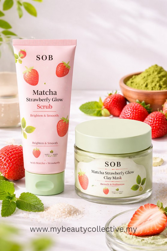
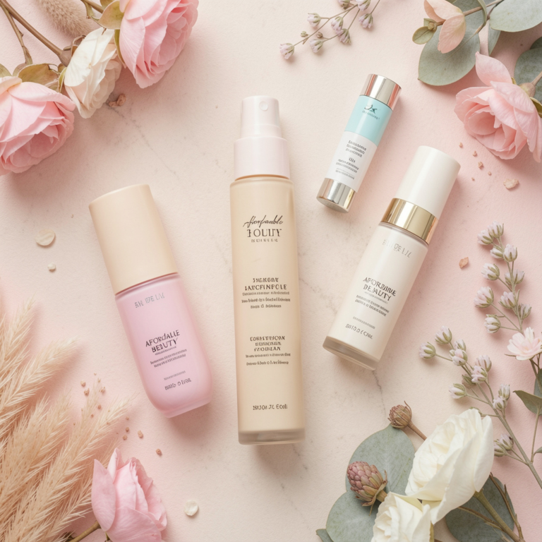
1. Keep It Minimal — Because Minimal = Premium
Across Asian beauty trends (especially K-beauty), minimalist packaging dominates. Clean labels, soft colours, and simple layouts signal quality, safety, and effectiveness.
Consumers associate minimal design with “clean beauty” and transparency — making them more likely to trust and purchase your product.
What works:
- Neutral tones (white, beige, soft pastels)
- Simple fonts (max 1–2 typefaces)
- Clear product name + key benefit
2. Clarity Builds Trust
Asian consumers are highly educated when it comes to skincare. They read labels, check ingredients, and compare products before buying.
If your packaging is confusing, overcrowded, or unclear — it creates doubt.
What builds trust:
- Clearly stated product function (e.g. “Hydrating Serum”)
- Key ingredients highlighted (e.g. Niacinamide, Hyaluronic Acid)
- Easy-to-read layout
👉 If customers understand your product instantly, they are more likely to buy it.
3. Texture & Finish Influence Perception
How your packaging feels is just as important as how it looks.
In the Asian market, certain finishes are strongly associated with premium skincare:
- Frosted glass → clean, clinical, high-end
- Matte finish → soft, modern, non-greasy feel
- Glossy plastic → more mass-market positioning
👉 The right finish can instantly elevate perceived value — even before the product is used.
🔗 INTERNAL LINK: https://www.respectmanufacturing.com/feeds/blog/skincare-package-design
4. Functionality = Real Value
Beautiful packaging may attract attention, but functionality is what keeps customers coming back.
Consumers today expect packaging to be:
- Easy to use
- Hygienic
- Travel-friendly
- Mess-free
Best-performing formats:
- Airless pumps → protect formula + hygienic
- Pump bottles → easy daily use
- Dropper bottles → controlled application
👉 If your packaging is inconvenient, customers won’t repurchase — no matter how nice it looks.

5. Match Packaging with Your Formula
Not all packaging works for every product. Choosing the wrong format can affect both performance and customer experience.
Examples:
- Serums → airless pump or dropper
- Creams → pump or airless jar
- Toners → spray or flip-top bottle
Sensitive ingredients (like vitamin C or retinol) need extra protection from air and light.
👉 Good packaging doesn’t just hold the product — it preserves its effectiveness.
6. Design for the Asian Consumer Mindset
Asian consumers value:
- Clean and safe-looking products
- Lightweight and non-heavy textures
- Skincare that feels gentle and effective
Your packaging should reflect these expectations.
Design cues that work well:
- Soft, calming colours
- Clinical or dermatology-inspired layout
- Simple and “non-aggressive” branding
👉 The goal is to make your product feel safe, gentle, and trustworthy
7. Don’t Overdesign
One of the biggest mistakes brands make is trying to stand out too much.
Too many colours, fonts, or design elements can:
- Confuse customers
- Reduce perceived quality
- Make the product look cheap
👉 In skincare, simplicity always wins over complexity
8. Small Details Make a Big Difference
Sometimes, it’s the smallest details that influence buying decisions:
- Smooth pump mechanism
- Secure cap (no leakage)
- Clean label alignment
- Consistent branding across products
👉 These details signal quality and professionalism — even subconsciously
Final Thought
Designing skincare packaging that sells is not about being the most creative —
It’s about being the most clear, trustworthy, and user-friendly.
When your packaging communicates safety, simplicity, and quality at first glance,
you’re not just attracting attention —
👉 You’re building confidence that leads to purchase.